
Even if they don't fall into my tiny little overlapping ovoid on the Venn diagram between "Soccer Fans" and "Design Snobs," anyone who has ever seen the crest used for the last couple of decades by the United States Soccer Federation has to have noticed how irritatingly juvenile it was. It looked like the logo of a kids' summer soccer camp in one of the red states. A little flying soccer ball (complete with pointy, speedy, "whoosh" lines) sat in the middle of some squishy letters and bunting in inexplicably inverted flag colors—blue stripes and stars on a red field. What? It was dense, tacky, and betrayed a conspicuous lack of familiarity with international trends.

The old U.S. Soccer crest had been on my naughty list for quite some time.
The old design was the graphic embodiment of American attitudes toward soccer in the late twentieth century and, consequently, U.S. Soccer's international reputation for many years: naïve, immature, and unprofessional. It was a blatant visual metaphor for our cultural distance from the major footballing nations of Europe and South America. In an age when the USSF, MLS and even FIFA itself are trying to make the case that the United States have outgrown their formerly infantile reputation in the footballing world, this update is long overdue. An organization (and indeed a nation) making appeals for the world to take it more seriously could not have hoped to be successful in that regard with a visual brand that looked inappropriate being worn by anyone older than twelve.
Let's take a look at the new crest. It's sharp, simple and powerful, technical and elegant. Its lines are pointed and aggressive but don't give in to the brash, cartoonish quality that too often permeates American sports brands (see Jacksonville Jaguars, for example). The American flag is worked into the new design in a way that doesn't remind me of discount bin Fourth of July decorations. The awkward experiment with non-canonical shades of bright blue seems to have come to a merciful end, as has the strange treatment of the stripes, and the new mark returns reverentially to the official, more austere shades and thirteen red-and-white stripes of the Star-spangled Banner itself. There is no need to depict a soccer ball, because Americans no longer need to be reminded of what the symbol represents. The idea of Americans playing soccer isn't a novelty anymore. The mark is self-assured in its stark simplicity. It is confident, mature and empowered.

The exciting new typeface, 90' (read as "ninety minutes"), by Tal Leming is a mature accompaniment for the refreshed brand. It is thorough and thoughtful work that I envy enormously. You can read about it from the man himself, here. If you've ever been at all curious about exactly what kind of effort goes into typeface design, this will give you a taste.
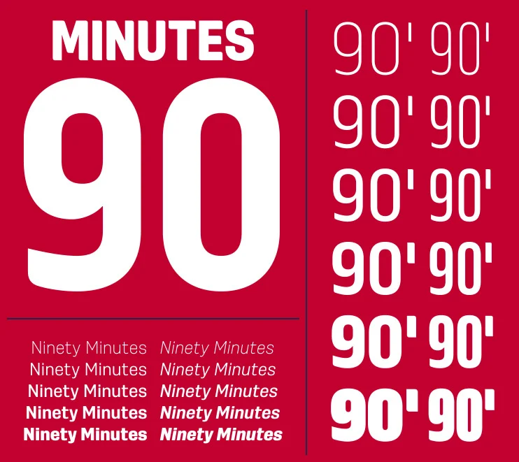
Gorgeous work by Tal Leming of Type Supply
This brand is to be taken seriously, to be respected. It's noble, mature and not to be messed with, which is exactly the message U.S. Soccer wants to communicate to the world. It positions the U.S., finally, as having emerged from our footballing adolescence ready to be equal participants in—and proponents of—global soccer culture.