Those of you who have read this blog or have ever asked me my opinion about logos n' such know that I tend to give rebrands and fresh designs the benefit of the doubt. I enjoy looking at design problems from the standpoint of the person charged with solving them and pointing out all of the successes of new designs, perhaps even despite a few specific shortcomings or public revulsion. I relish opportunities to pick out redeeming qualities and to play devil's advocate when popular opinion coalesces around rejection (see my entry on Google's from September of last year), and am on the designers' side more often than not. In part, this is because I'm frustrated to hear a lot of very self-assured criticism coming from people who don't seem to be thinking about things from a designer's point of view. When a company or institution (especially one that I think highly of) undertakes the massive challenge of rebranding, my first instinct is to applaud the effort and point to its often under-appreciated benefits rather than scowl and complain about leaving well enough alone.
But despite this policy of mine, I must sadly concede that I cannot show the same empathy to The Metropolitan Museum of Art's new logo. With great effort, I can begin to identify the objectives and make some educated conjectures as to the designer's thought process, but every attempted solution fails spectacularly. No matter how I look at it, I can't make its benefits outweigh its flaws.
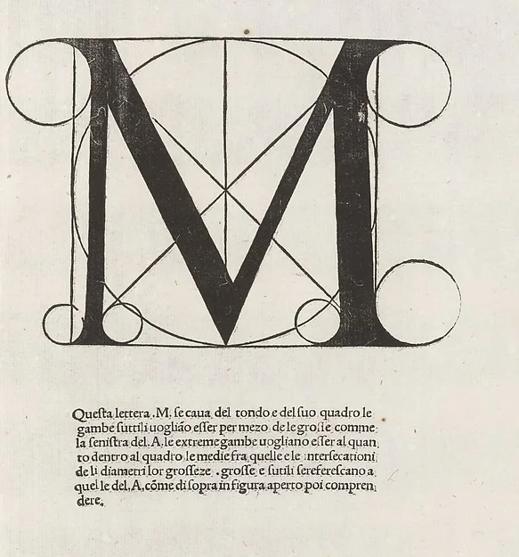
Of course, we owe it to the parties responsible for this thing to look at the old Met logo and try to figure out what it was they were trying to do. The museum's old mark was derived from this print by Luca Pacioli from 1509, and was used essentially unchanged as the Met's primary mark since the 70s. This was a highly effective mark for the museum: distinctive, recognizable at a distance or at small sizes but with exciting details to reveal close-up, evocative of the museum's collections, and self-referential, declaring to be, itself, a work of art.
It was lovely and simple as a logo should be, but I can imagine some growing issues with it, both technical and cultural. It has fine lines that disintegrate on computer displays and can cause problems with cheaply printed or photocopied collateral materials. Culturally, it very pointedly references a Renaissance aesthetic that, while relevant to the museum's collections is less and less a part of its public-facing narrative. Modern and contemporary art are to become more prevalent parts of the collections, which, in any case, already extended far beyond the Classical. So it makes some sense that the museum would envision an identity with less specific ties to a particular time and place in the history of art, a bolder and more concise statement about itself as a universal authority on art and culture around the world.
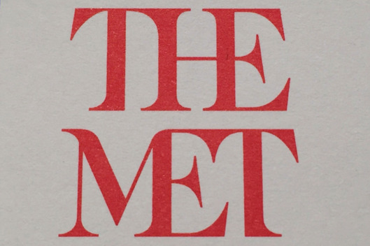
I think that thrust is evident in the new design, which embraces its casual, colloquial moniker (The Met) and casts aside its predecessor's high-minded references to antiquity. And that would all be well and good if the new mark's technical execution weren't so egregiously faulty. It is horribly unbalanced, with much greater mass on its right side then on its left; the H is conspicuously off-center and the first T seems like it's about to collapse into the pit of the M. Designers speak often of the need for a mark to feel "comfortable" or "settled," but this thing feels cramped, forced and precarious, as if it were built from spare parts and in a great rush. There is no structural coherence between the two words: no alignment, no grid, not even a shared center axis. As Justin Davidson of Vulture puts it,
The whole ensemble looks like a red double-decker bus that has stopped short, shoving the passengers into each other’s backs.
This new mark does rectify some potential problems with the old mark, problems that, admittedly, are quite important for an institution of this kind to address, such as digital portability and more universal appeal. But in solving these problems, it lets any number of even more rudimentary best practices fall by the wayside, the equivalent of fixing a flat tire by removing the wheels. The initial problem is gone, but now the whole thing doesn't work.