
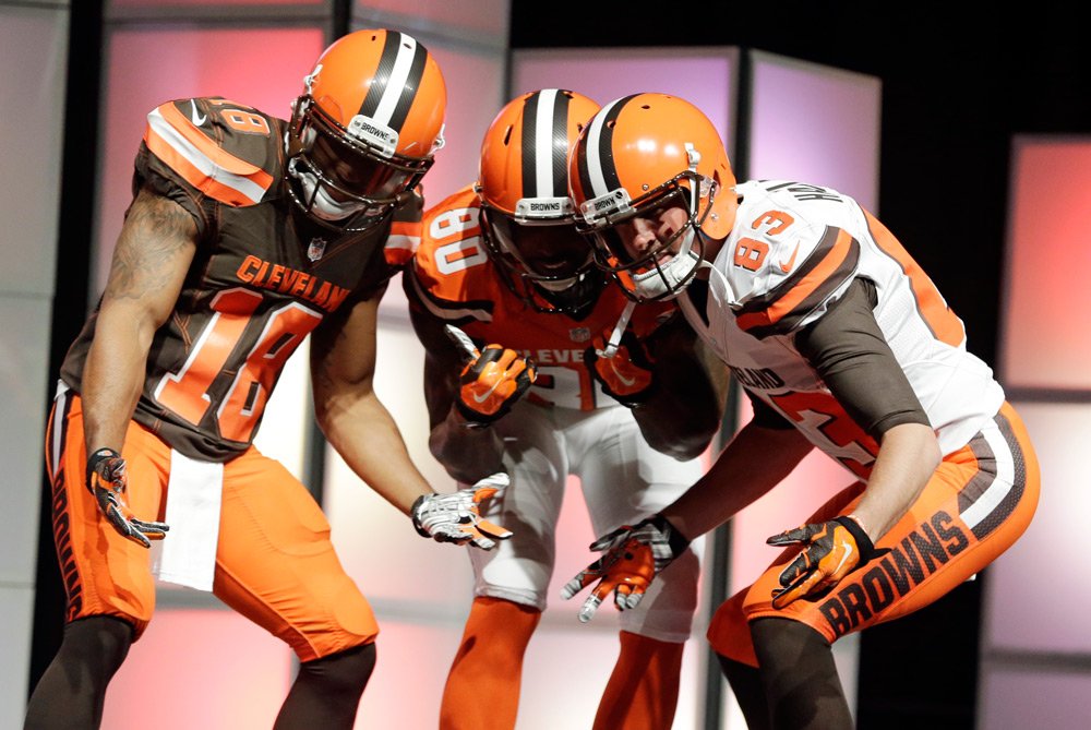
I’m delighted (don’t judge me for the sorts of things that get me excited) that Nike and the Cleveland Browns have brought typography back to NFL uniforms. Apart from its obvious—and mandatory—manifestations in the form of large numerals and player’s surnames, letterforms have usually been relegated to tiny logotypes in the center chest, and have almost never been used creatively or as prevalent, distinctive design components in NFL player attire.
There has been some experimentation with type on football uniforms, almost entirely by Nike and almost entirely on collegiate uniforms, notably those worn by the infamously ostentatious Boise State Broncos and Oregon Ducks. These are both teams whose visual brands have been defined by Nike as highly progressive and experimental.

Nike's progressively-branded, contracted college teams have done some more experimenting with uniform typography, but it hasn't made it to the NFL until this year.
Contrast them with the Cleveland Browns, who have long relished a stubbornly classic aesthetic, from their 70’s color scheme to their lack of recognizable logos or graphic ornamentation of any kind. You can even notice, if you look for it, where TV networks have trouble fitting the Browns’ brand into their graphics packages, which normally reserve space for a self-contained logo, something every other NFL team has at least one of. Often, their solution has been to resort to using images of the uniform itself, usually the helmet, which is actually the most distinctive part of the Browns’ brand because of its conspicuous lack of the expected embellishments.

Without a recognizable logo the Browns are often represented in TV graphics packages by a picture of their famously blank helmet.
So how do you modernize and refresh a visual identity that is definitively grounded in an old-fashioned sensibility? I think Nike and the Browns have come up with about the best answer they possibly could have. The new look is fresh and exciting by virtue of its transgression of the current formulas for uniform decoration, but remains true to the brand’s personality by employing simple, blocky, almost industrially pragmatic sans-serif type that still manages to avoid becoming a logotype. Thus, the Browns can revive a stale visual identity and still be known as the team with no logo, something in which I imagine—and hope—that they take a strange sort of pride.
© 2015 Cleveland Browns
© 2015 Cleveland Browns